


We designed targeted POSM units for Maliban’s popular biscuit variants – Energy+ and Tea Time. Each unit is crafted to match the personality and positioning of the product – bold, energetic, or warm and inviting – while ensuring optimal pack visibility and retail presence.


Bold red-orange gradient with a lightning bolt motif to highlight “energy” Strong side panel branding with layered depth Dual-shelf layout optimized for visibility and easy stock rotation Designed to stand out in high-traffic store zones Visual language reinforces power, energy, and quick snacking
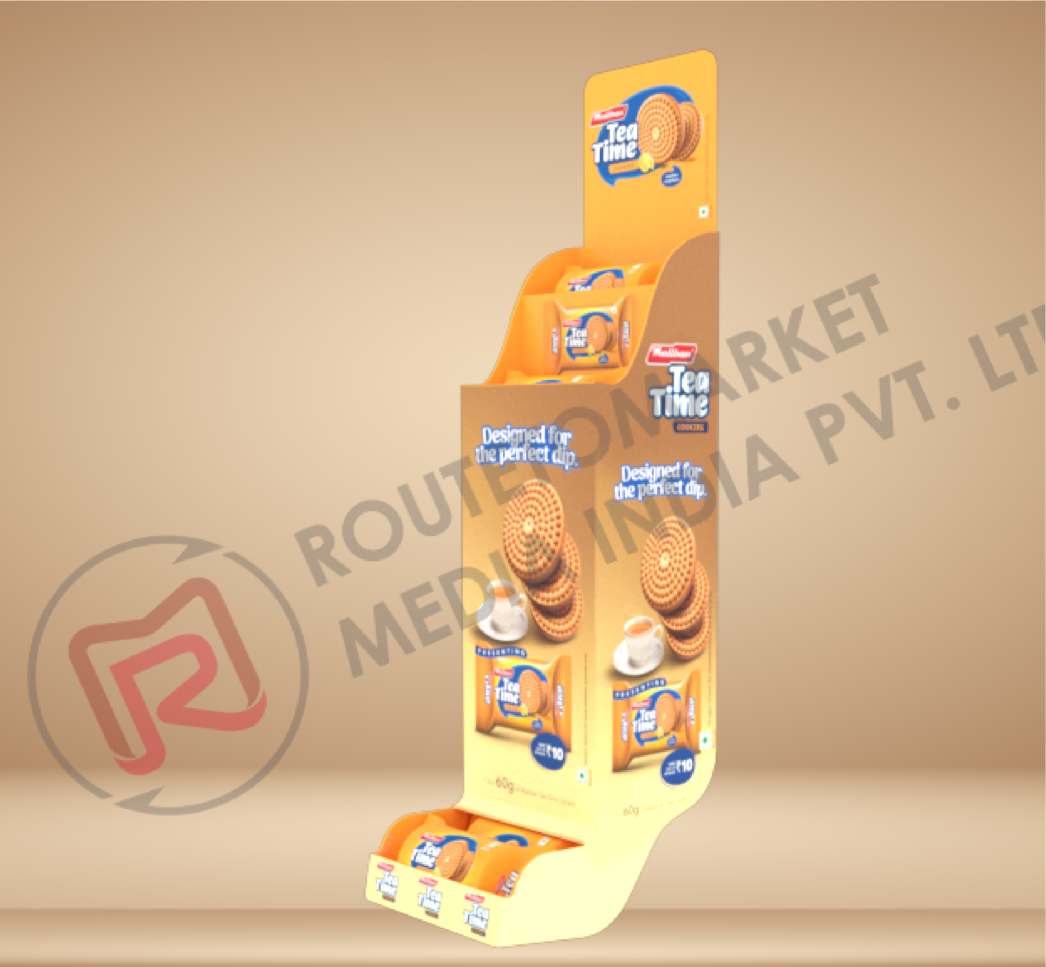
Tall vertical structure with warm beige-brown tones for homely appeal Messaging: “Designed for the perfect dip” featured prominently Product-context visuals (biscuits with chai) create instant emotional connect Compact footprint for small store aisles or kirana setups Strategic layout encourages top-to-bottom browsing
Helped differentiate SKUs on shelf with thematic branding Strengthened brand identity for Energy+ (bold, quick fuel) and Tea Time (comfort, pairing) Improved in-store placement in modern & general trade formats Drove product trials and visibility via compelling design language.
